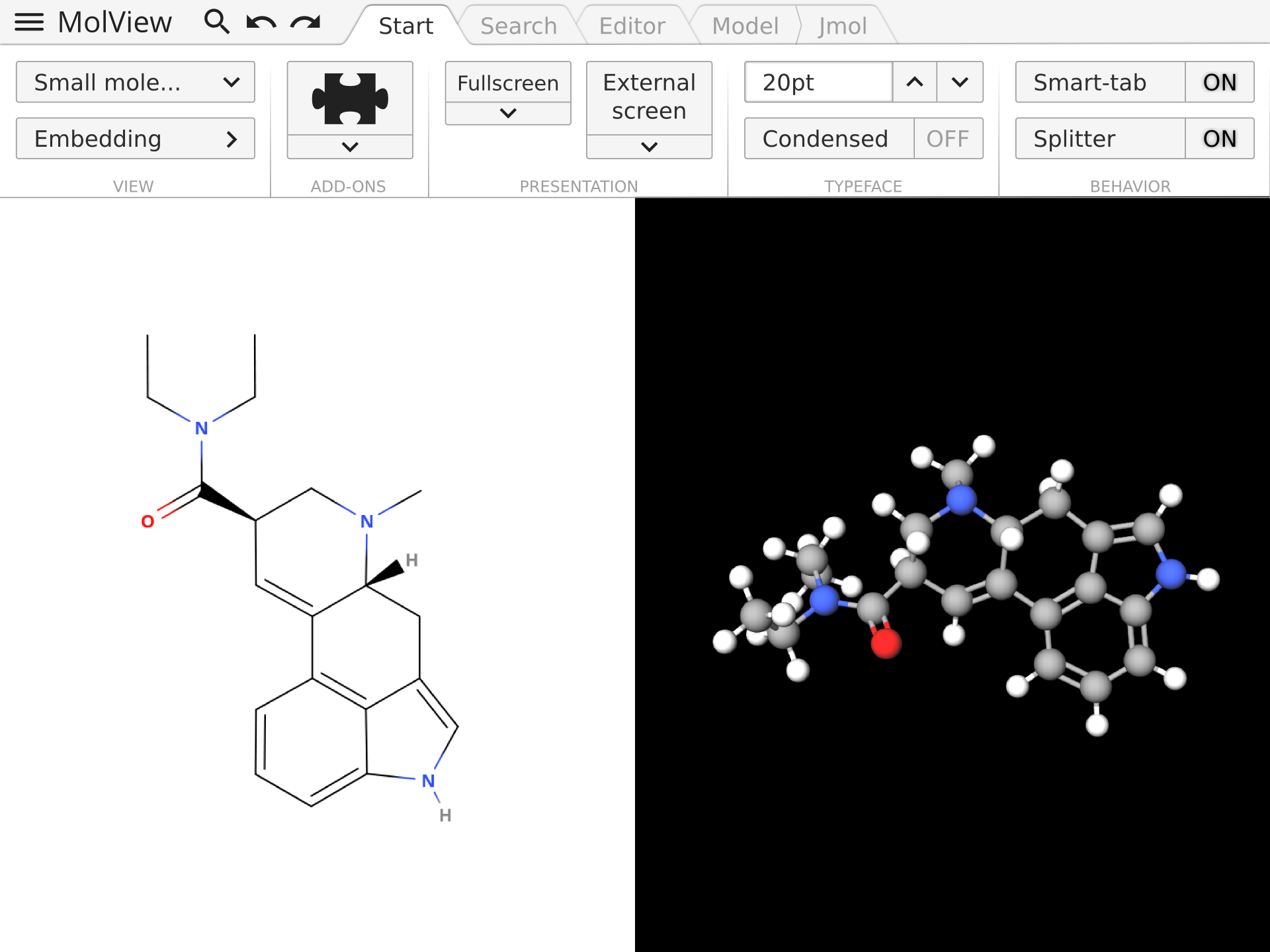
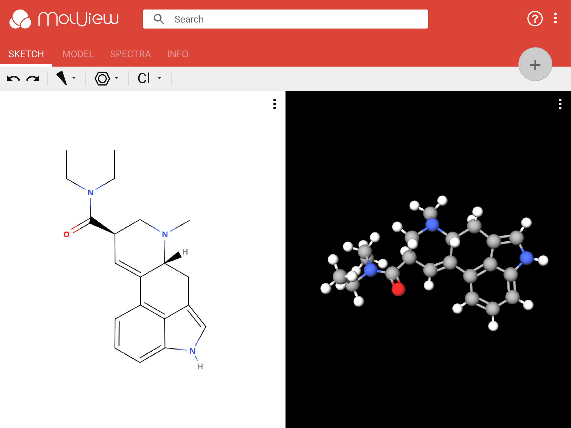
A while ago I shared a new design for MolView that was partially inspired by Microsoft Office. In this post, I’m presenting another design that is based on Material Design. Below is a comparison of the old mockup and the new mockup. You can slide the splitter to see the difference. The new design is the one on the left, it takes the best ideas from the right design and I believe it suits the purpose of MolView 3 much better. It’s simpler, more responsive and more colorful.
Search
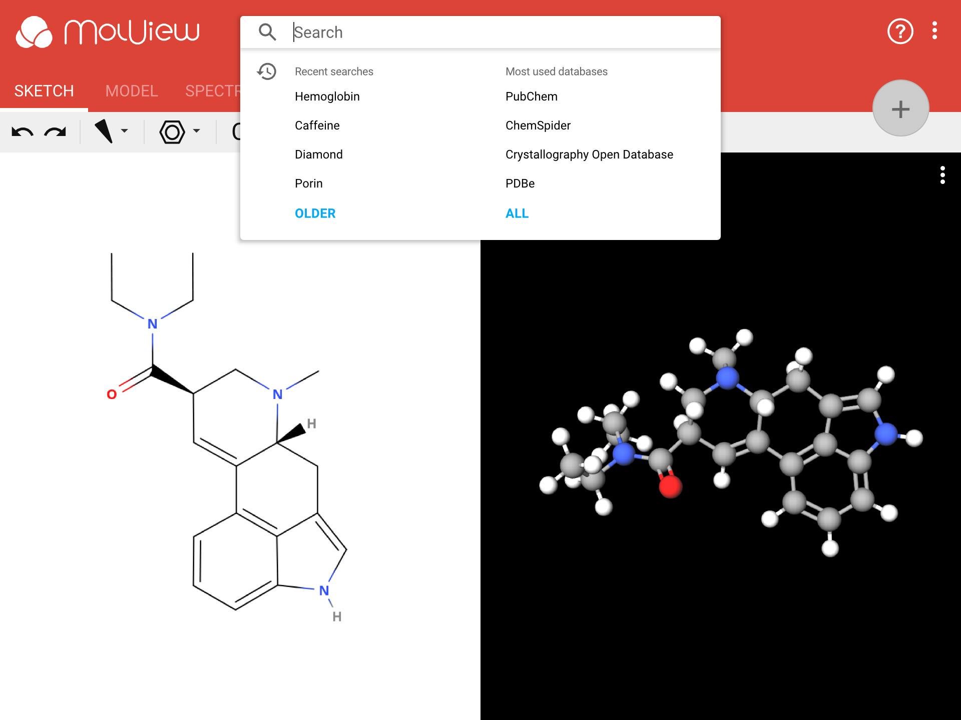
The search input is hard to miss, and that is a good thing because searching is one of the primary features in MolView. When you focus the search input, it will show a pop-up like in the picture below.
Guide
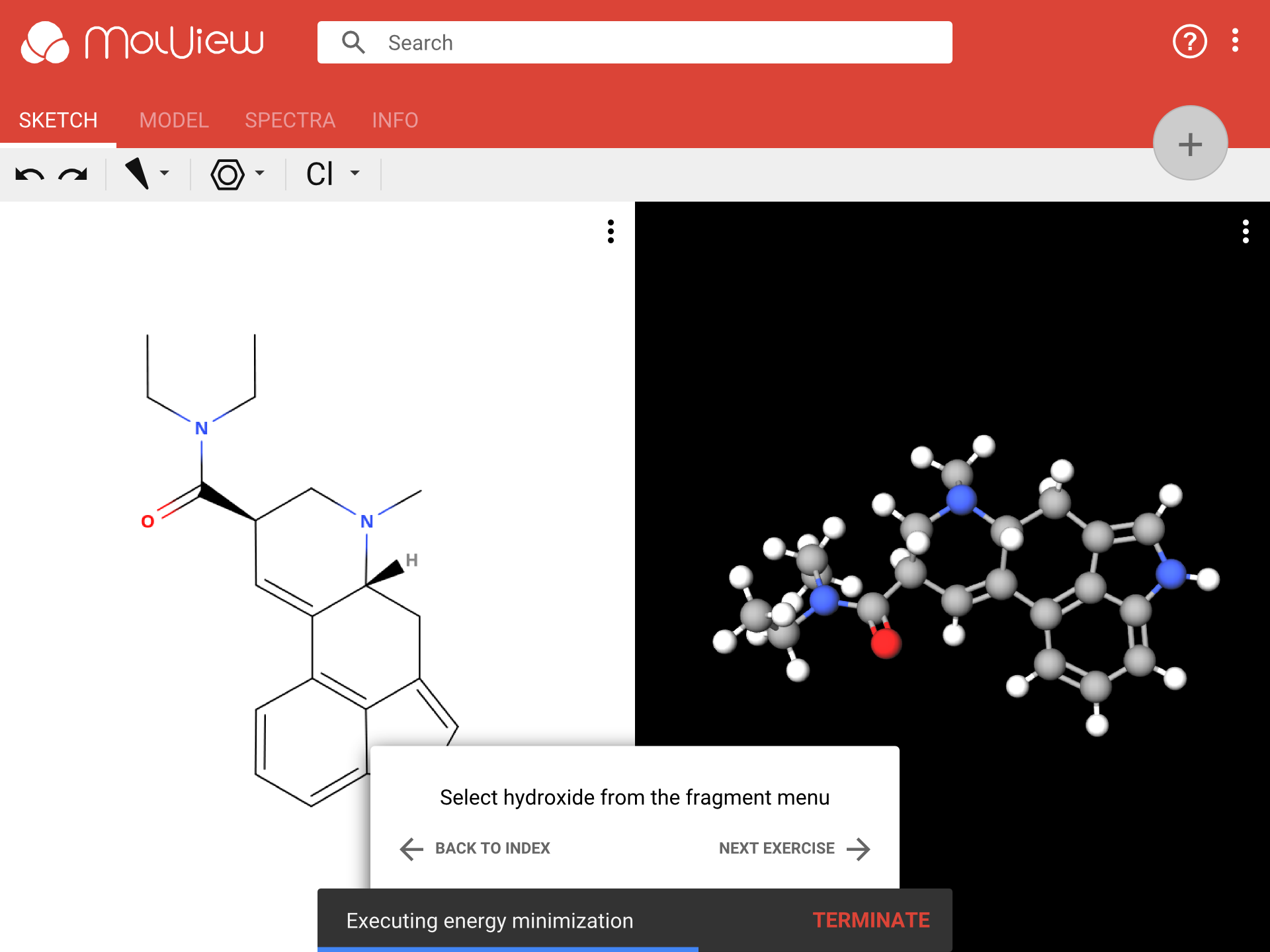
A guide to explain tools to new users will be one of the most important new features in MolView 3. This design shows a small panel at the bottom of the application as shown in the picture below. This panel will tell you what to do next. It will also automatically proceed to the next step.
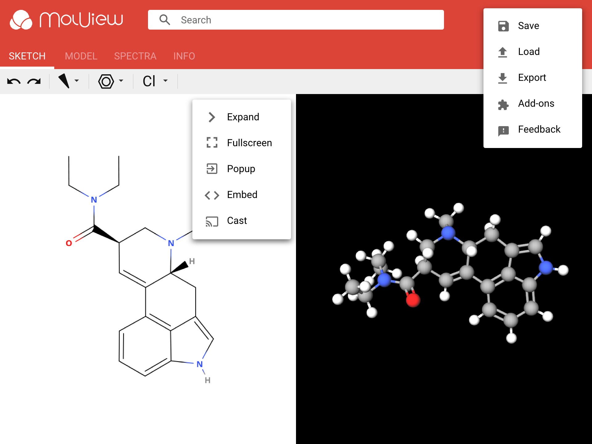
Menus
In this design I have tried to keep the menu’s as simple and straightforward as possible. The picture shows the main menu in the top-right corner and a view menu for the sketcher. Each view (sketcher, 3D model, spectra viewer, etc.) will have its own view menu containing some standard actions, for example to make the view fullscreen or to embed the view content in your webpage.
Floating action button
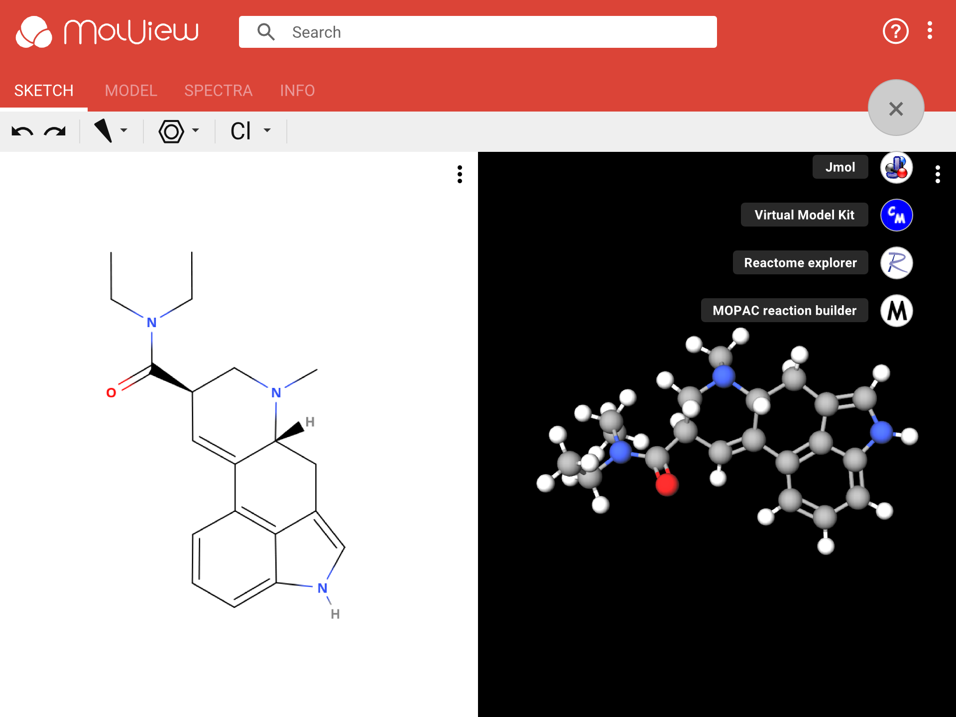
All features in MolView 3 will be packed in modules. A module can add a new view. For example a Jmol viewer or a reaction pathway explorer. Extra modules, such as third-party modules and optional/experimental features, can be added and via the add-on manager. Some add-ons are run automatically in a certain context. For example, a DNA sequence viewer might be activated when you load a protein.
Other add-ons, like a Jmol viewer, either have to be launched manually or should be activated by default. The floating action button (big rounded button on the top-right) in this design could be used as a shortcut to launch such modules. However, I’m still unsure whether I will retain this button in the final design.
Advanced search
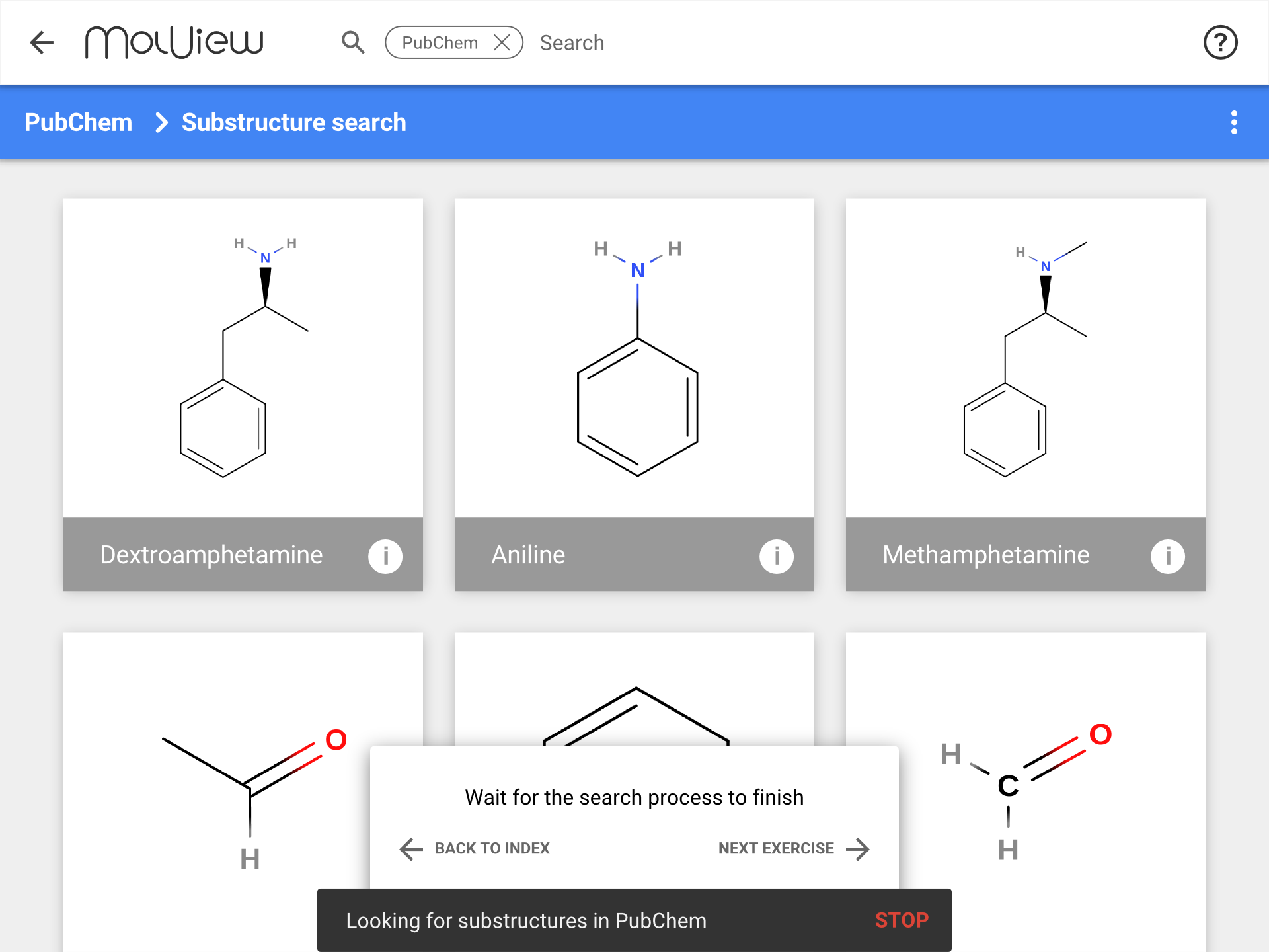
A different application window is used to display multiple search results from databases like PubChem. You can also access more advanced search tools via this interface. And this interface will add more ways to dig through databases, such as plain tables or graph representations (for a pathway database for example).
Edit the mockups yourself!
As an experiment, I created these mockups in Google Drawings instead of the open-source program Inkscape, which I normally use. The files are publicly accessible. If you have a Google account you can easily copy one and try out a different color, or even add your own buttons to the toolbar! To copy a drawing to your Google Drive, go to one of the links below and click File > Make a copy.


